
Thursday, December 17, 2009

Wednesday, December 16, 2009
COPYRIGHT
We attempted to get a copy right clearance by emailing the record label, Interscope Records, and asking for their permission to produce a media product with their song. Although we never heard anything back from them, when we tried to put out music video on youtube it had been authorised by the record label as it is being used for an education purpose.
Album Cover and Myspace Photoshoot
Whilst reshooting our music video in the dance studio we decided to also to a photo shoot for our album cover and Myspace. We decided to do it here as we could then have the dance theme running throughout our products as the album cover and Myspace would also have the dance studio mise-en-scene.
We wanted to make us look glamourous, however still have a dancing edge and a New York theme connecting all the shots. Therefore we decided to have full makeup and hair, a gold jacket, black leggings, heels and both a black vest top and 'I Love NY' top.
We tried to vary the shots as much as possible with the use of all the different distances and shots with both of us and only single shots. This would allow us to have a lot more variety to play around with when it comes to putting together our album cover and Myspace. Here are a few images taken from the day:


Tuesday, December 15, 2009
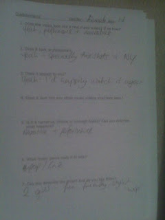
Audience Feedback Questionaire
When conducting our audience feedback we created a questionaire in order for our audience to fill in and for us to gain maximum feedback. The questionaire worked really well as many of the people answered in constructively and we were able to get a large amount of feedback from our target audience. Overall the feedback we gained was positive, however there were one or two negative remarks. Here are a few examples of the many questionaires we got:


Monday, December 14, 2009
YOUTUBE
With uploading our music video onto youtube. This has enabled us to constantly check how many views and ratings we are getting, It also allows us to receive feedback from across the globe. Here is some feedback we have gained:
TIMELINE
This is a bit late, but due to my phone breaking I wasn't able to make upload this photo for a while.
Here is the timeline Loren and I made to plan out our shots with the time to make sure we had something for every second of our song.

Here is the timeline Loren and I made to plan out our shots with the time to make sure we had something for every second of our song.

We wrote our ideas on sticky notes as this enables us to change shot order as often as we like and comparing it to how it will look with the other shots.

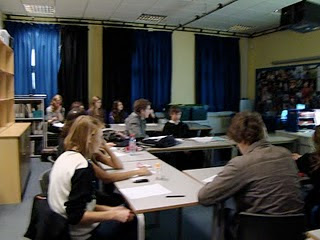
AUDIENCE FEEDBACK
The core target audience for our music video is 13 to 19 year old girls, fans of RnB music and dancers. We decided to screen our music video in a lunchtime to gain maximum feedback in order to make our music video the best it could be. We made a questionnaire which Loren will be scanning in some time soon and also asked a few people some questions individually.
Overall feedback showed that the New York and dance routine footage was the most interesting. I reckon this was perhaps because it involved a lot of camera movement, keeping the audience engaged.
However a lot of audience feedback suggested that the narrative wasn't very clear and that the choice of track wasn't a good one. However we think the track fitted the lyrics to the song very well and were fixed on producing a music video to 'Top of the World - PCD'
We also got feedback from our peers. Here are some criticism:
- The end shot ends very abrupt. Perhaps fade it
- Parts of the video were out of synch
- The long shots of Loren and I at the window are rather dark and should try lightening them.
Dearest Loren
Yes, I think thats a great idea. We'll just write up what we thought underneath our videos in our individual blogs. Good thinking Loren! Keep it up!
To Nisha
Nisha darling,
seeing as we have done one question each on our evaluation but planned them together, im thinking type up the stuff about the questions we never said...?
seeing as we have done one question each on our evaluation but planned them together, im thinking type up the stuff about the questions we never said...?
Friday, December 11, 2009
Evaluation
On Tuesday we conducted our evaluation for the project. To add some visual context to it we decided to record us saying it instead of typing it up. As a group of two Nisha and I thought it would be most effective if we split the questions up between us, me getting questions 1 and 3 and her getting questions 2 and 4. We had to speak for minimum of 15 minutes and a maximum of 30 minutes. At first we were worried that we would not be able to fill this time, however once we got started we could not stop talking and found that we were pushed for time rather than trying to fill up the gaps.
Both Nisha and I hate performing in front of the camera and therefore found this task very nerve racking and hard. We both would of preferred to write an essay!!Overall though i felt it went okay, with us answering every question and using the maximum amount of time. However on my part i felt that i let my nerves get the better of me and left out some vital things which would of made the evaluation a lot better if i had put them in. Due to this i have decided to post a few bits that i missed out up on my own blog, filling in all the gaps. I felt that Nisha held herself together well and answered everything pefectly. Her questions came across a lot more fluent and well thought out than mine as she was able to overcome her nerves of performing in front of the camera a lot better.
Both Nisha and I hate performing in front of the camera and therefore found this task very nerve racking and hard. We both would of preferred to write an essay!!Overall though i felt it went okay, with us answering every question and using the maximum amount of time. However on my part i felt that i let my nerves get the better of me and left out some vital things which would of made the evaluation a lot better if i had put them in. Due to this i have decided to post a few bits that i missed out up on my own blog, filling in all the gaps. I felt that Nisha held herself together well and answered everything pefectly. Her questions came across a lot more fluent and well thought out than mine as she was able to overcome her nerves of performing in front of the camera a lot better.
Wednesday, December 9, 2009
Evaluation Planning
Before we did our evaluation we decided to plan it together to make sure we included everything we wanted to say in it. Here is evidence of our planning:
Goodwin Planning Chart

Vernallis Planning Chart

Album Cover Planning Chart

Myspace Planning Chart

Goodwin Planning Chart

Vernallis Planning Chart

Album Cover Planning Chart

Myspace Planning Chart

Wednesday, December 2, 2009
Artist Name
Whilst editing together all our footage we had to come up with a suitable artist name in order to go on our album cover and myspace. After a long discussion we narrowed it down to two names which were M.E.T and Harlem.
We decided on these two names because Harlem is a borough in New York, therefore reflecting our New York roots within the artist and M.E.T because it is describing how we met in a metropolitan city so almost a play on words. When discussing it with a few more people, they felt that the best name for our artist would be Harlem because it is more catchy and easy to remeber and understand the meaning. The name M.E.T is a bit too complex for a band name. So after hearing this feedback we chose Harlem to be our band name and decided that M.E.T would be a good name for our debut album as it shows us starting off on our career.
We decided on these two names because Harlem is a borough in New York, therefore reflecting our New York roots within the artist and M.E.T because it is describing how we met in a metropolitan city so almost a play on words. When discussing it with a few more people, they felt that the best name for our artist would be Harlem because it is more catchy and easy to remeber and understand the meaning. The name M.E.T is a bit too complex for a band name. So after hearing this feedback we chose Harlem to be our band name and decided that M.E.T would be a good name for our debut album as it shows us starting off on our career.
FINISHED!
After 9 long hours of work on Friday we have finally finished our music video, myspace and album cover. All our hard work has paid off in the end though as the final product looks so much better than we could of ever hoped. We screened the music video to our media class today to see whether there are any final changes that need to be made before screening it to our target audience and this is the feedback we got:
- The contrast between the brightness of New York and the black and white performance shots work really well
- Nisha actually looks as if she is singing the lyrics and her lipsynching is really believable
- The line 'Won't let the city get on top of me' looks out of synch compared to the rest
- The last shot ends a little bit abruptly and could be faded to make it seem more natural
- The shot of blowing the kiss and the end posing shot could be swapped round
- The two shots are blurry - do not know whether it was intentional or not
- The shot against the window could be made brighter as it seems as bit dark at the moment
Album Cover Feedback
When showing Miss Blackborow our album cover this is the feedback she gave us:
- Too much black and white at the moment
- It seems as if it is the single cover and not the album cover
- I like the front shot of the pair of you as it shows how you are different but yet similar - reflection of band image
- The image on the inside is stretched and should only be used for one side
- The back image is good of Nisha but not so good of you
- Try having just Nisha on the back then choosing a different picture of you to have on the front
- Make the title smaller and more subtle
- Nish's head on the front needs to be made bigger otherwise it looks strange
- The institutional information needs to be made smaller
- Make the album title the same colour as the red lipstick to make them both stand out and make it slightly smaller
Myspace feedback
When showing Miss Blackborow our myspace, this was the feedback she gave me:
- Too much text and not enough images
- Promoting the single rather than the album
- There are no visual images of you two girls apart from your profile picture promoting you
- The links are good, needs more of these
- Needs to be more exciting and capture your attention more when you look at it
- I like the colour scheme as it reminds me of New York and this is the part of your band that you are promoting to make you unique
- Needs record labels on it
- View other artists myspace's to get ideas
- Make up a name for the performing arts college to make it more believeable
- Banner needs to be more centralised at the top of the page
- Have a header with your name on it to make it identifiable who you are when you open the page
- Everything needs to be headed, no floating images or text
- When promoting the album, make sure you only use the album cover and not the whole template
- Everything that is an advertisement or a link needs to look like one
Subscribe to:
Posts (Atom)
